
Key drivers analysis (KDA) is a very commonly used in marketing analytics to determine what factors are strongly related to key performance indicators (KPI) such as brand trust, loyalty, customer satisfaction, NPS, purchase intent, or the more top line sales revenue. You can get insights from your survey data.
While KDAs are commonplace, there is still a substantial cost related to running a full analysis as it requires a technical skill set. Our approach enables users without statistical software skills to explore their data in a fast and appealing delivery, while keeping a robust scientific methodology. Seamlessly upload your data, let our platform do the hard work, and download your ready to comment and present slides deck!
But what are key drivers anyway? Drivers will be all factors that could potentially impact your performance metric. The factors that drive performance outcomes in a more significant way are known as key drivers. Therefore Key Driver Analysis. In essence, KDA will provide you with the weights (%) that each factor has on achieving your target metric. If you consider that you cannot manage what you don’t measure, measuring and getting knowledgeable about the impact of these key drivers should enable you to improve how you manage your performance.
Let’s consider the following example, a customer satisfaction survey in which the factors are measured in a scale of 1 (very unsatisfied) to 5 (very satisfied); the main KPI, the answer about how likely they would recommend the product, is also measured in a scale of 1 (not at all) to 5 (absolutely). These are the definitions of the survey questions:
- satisfaction: Overall I am satisfied with the services provided by the company
- information: Overall I am satisfied with the information and assistance received when interacting with the company in the last year
- guidelines: I am satisfied that the guidelines and information sheets are clear and useful
- professionalism: The courtesy and professionalism I experienced when interacting with the company during last year was of a high standard
- service_range: I was satisfied with the range of services provided
- pricing: Pricing structure was competitive and provided value for money
- issues_solving: Overall I am satisfied with the time taken to resolve issues
- innovation: Services are innovative and allow me to increase my productivity
- privacy: Privacy matters and corresponding legislation are taken seriously
- timeliness: The timeliness of actions taken during a complaint process was satisfactory
- needs: Overall the services I subscribe to cover most of my needs
Before we start launching the survey, in the design stage we need to be assessing the sample size, how many answers we need to collect for the results to be statistically representative (you can use our online calculator here). Let’s assume we have 496 clients; with the usual 10% margin of error (precision) and 95% confidence (19 out of 20 answers are expected to fully represent the real population), we would need to collect at least 80 answers. The number of answers we collect is also going to impact the KDA calculations, as there is a relationship between how many factors can be considered and the quantity and variability of the data in terms of number of answers.
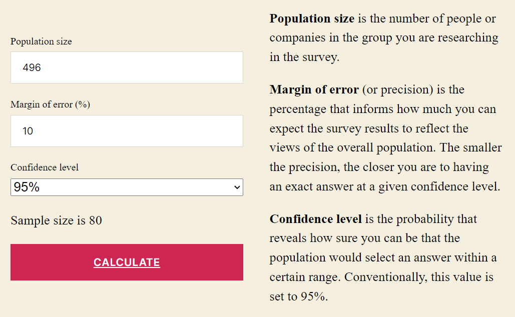
Once the survey has been closed, and we consider the data collection completed, it is likely that we may not have accomplished the target number of 80. For the sake of this example, let’s assume we only obtained 60 answers. We would need to recalculate backwards, to acknowledge the balance between lesser confidence and/or higher margin of error (lower precision).
Using the calculator, we would be able to assess that 60 answers, keeping the 95% confidence level would represent an increase of error towards 12%. On the other hand, keeping the 10% margin of error, would represent a fall in the confidence down to 90%.
Next steps, we can use our Marketing Analytics API to upload the answers to the survey to obtain a slides deck with the analysis of the survey. It takes 3 API calls:
- kda: upload a CSV file and inform of the ‘y’ parameter (which is the KPI to explain).
- answer: makes sure the machine learning engine has already finalised the analysis.
- slides: downloads the slides deck.
The main part of the analysis is determining the Effect Matrix, a visual representation of two facets of the drivers: (1) how important they are to explain the KPI, and (2) how significant they are in impacting it. See an example below, in our survey data analysis.
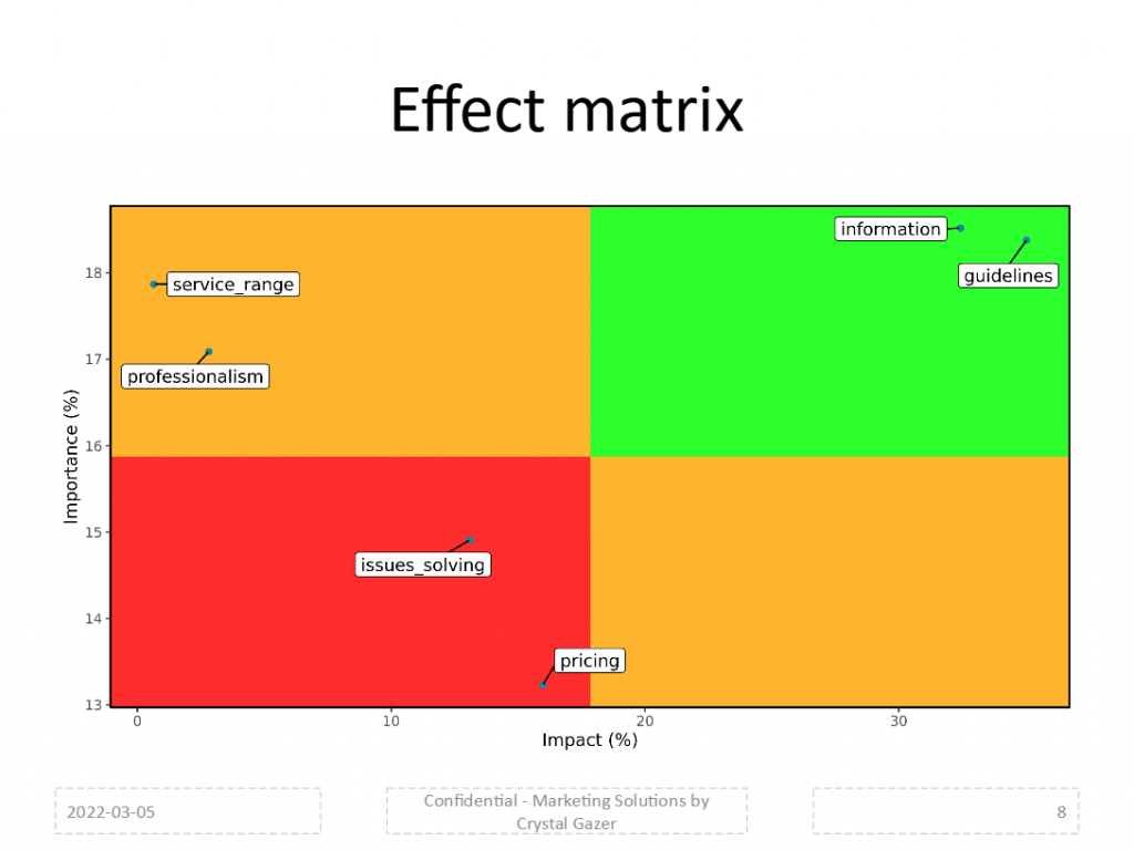
The graph depicts the drivers that the algorithm detects as connected to the KPI. In the horizontal axis you can see the impact of the drivers, while the vertical axis shows the importance. Both measures create the Effect Matrix, in which the green cell contains those high important-high impact drivers, or Key Drivers; the red cell will contain drivers of low importance-low impact, so we can avoid our focus on those.
This analysis can then portray our new strategy to improve the KPI results, by focusing on the key drivers, while avoiding the drainage of our efforts on the low ones.